Raleigh FC: Rooted in Tradition, Built for the Future
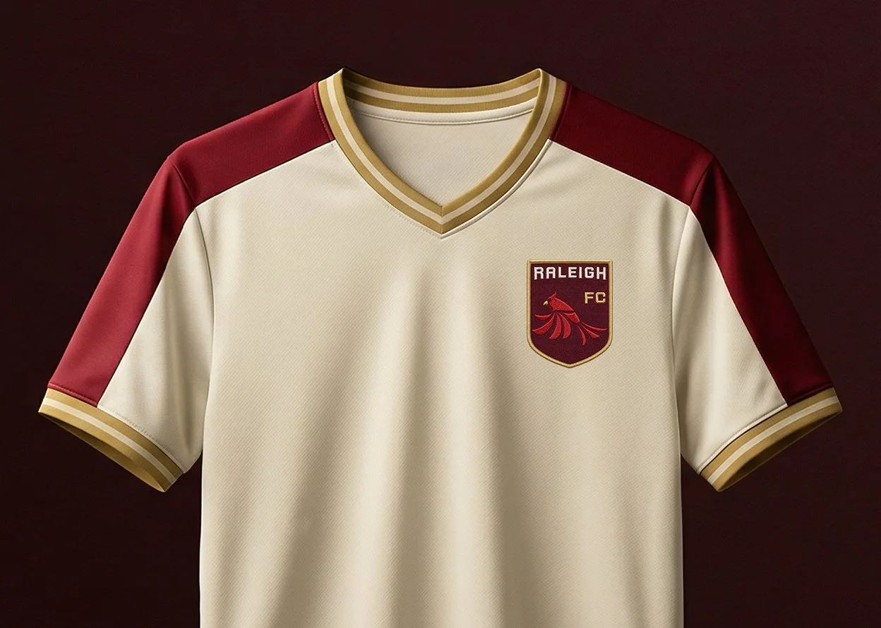
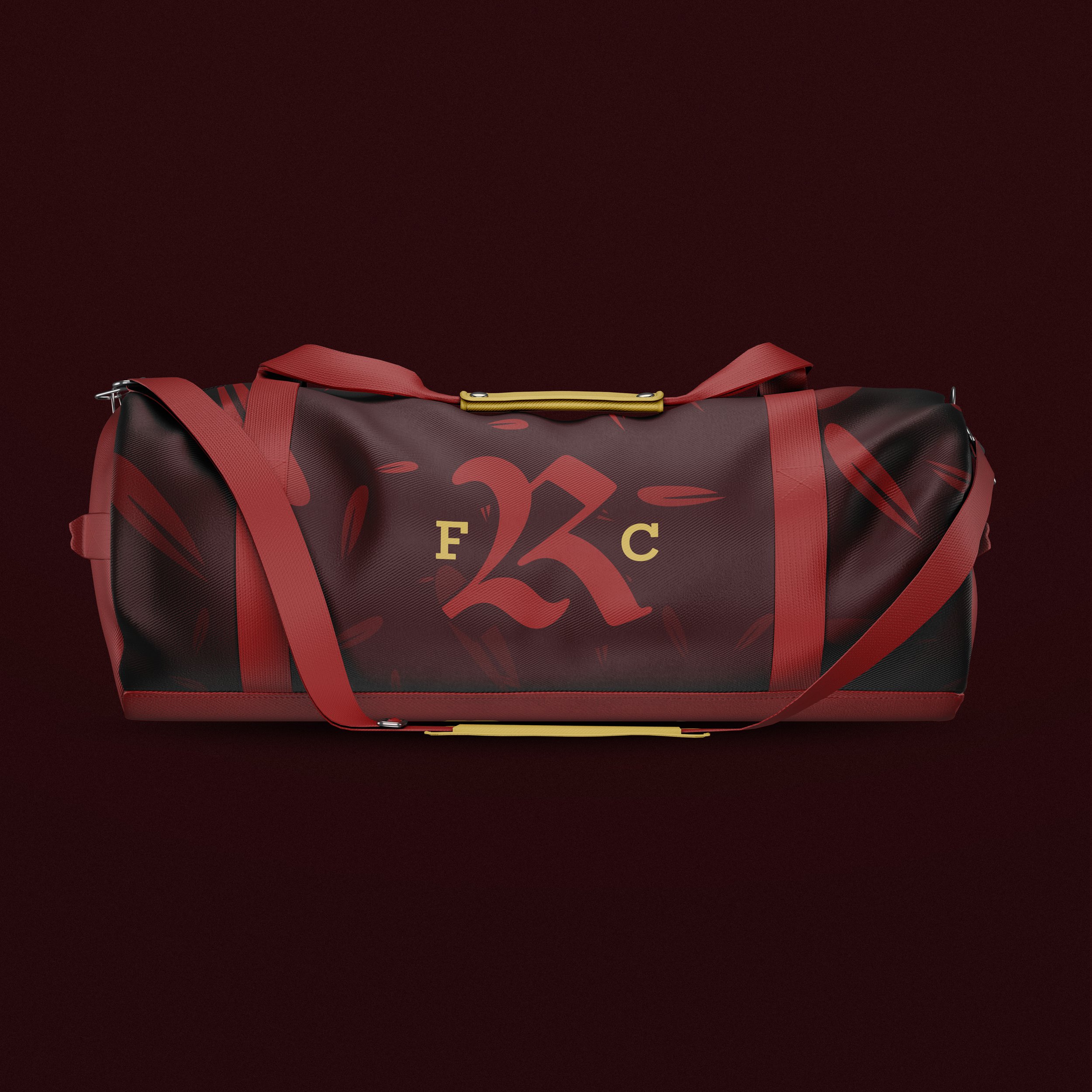
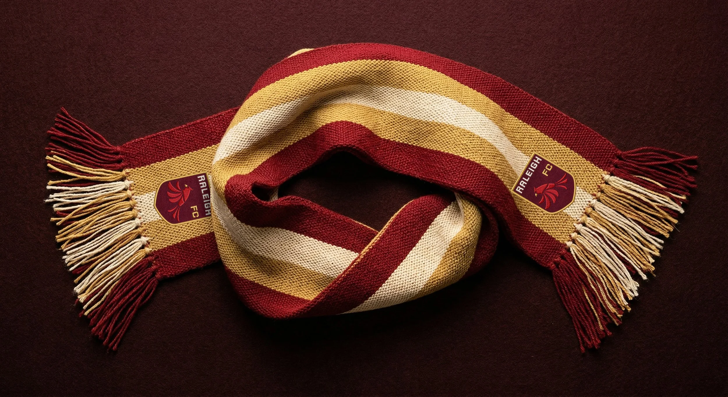
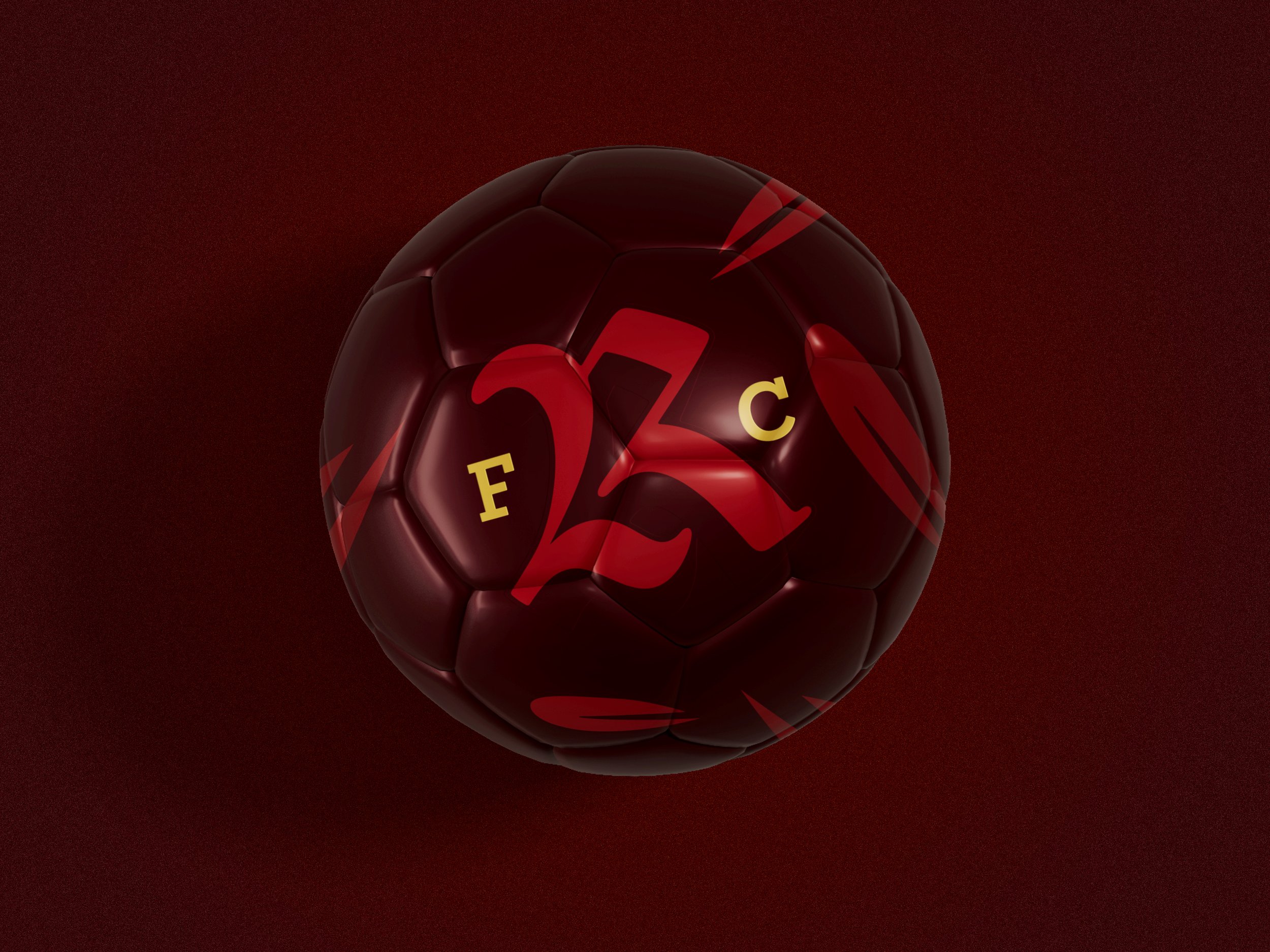
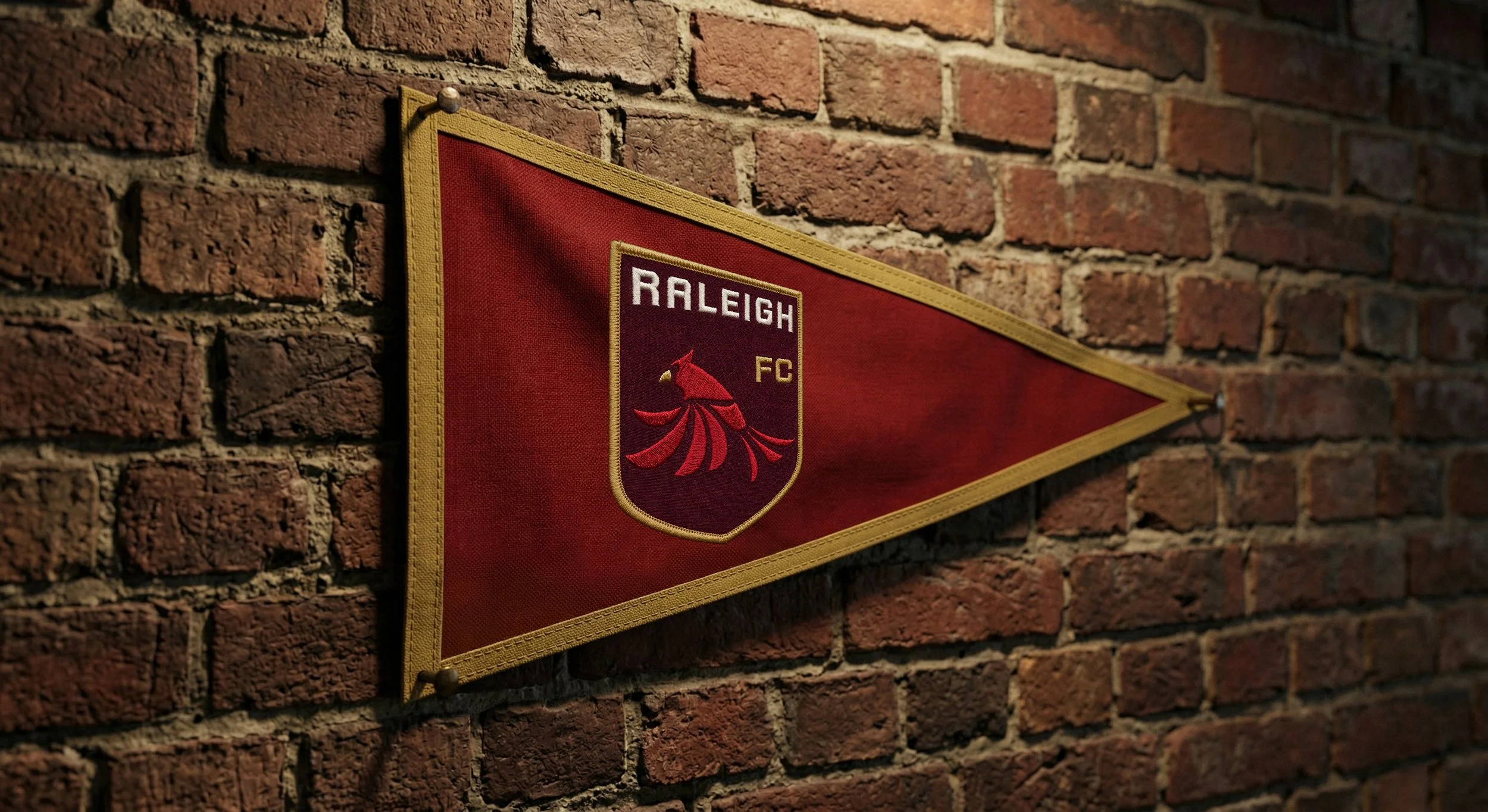
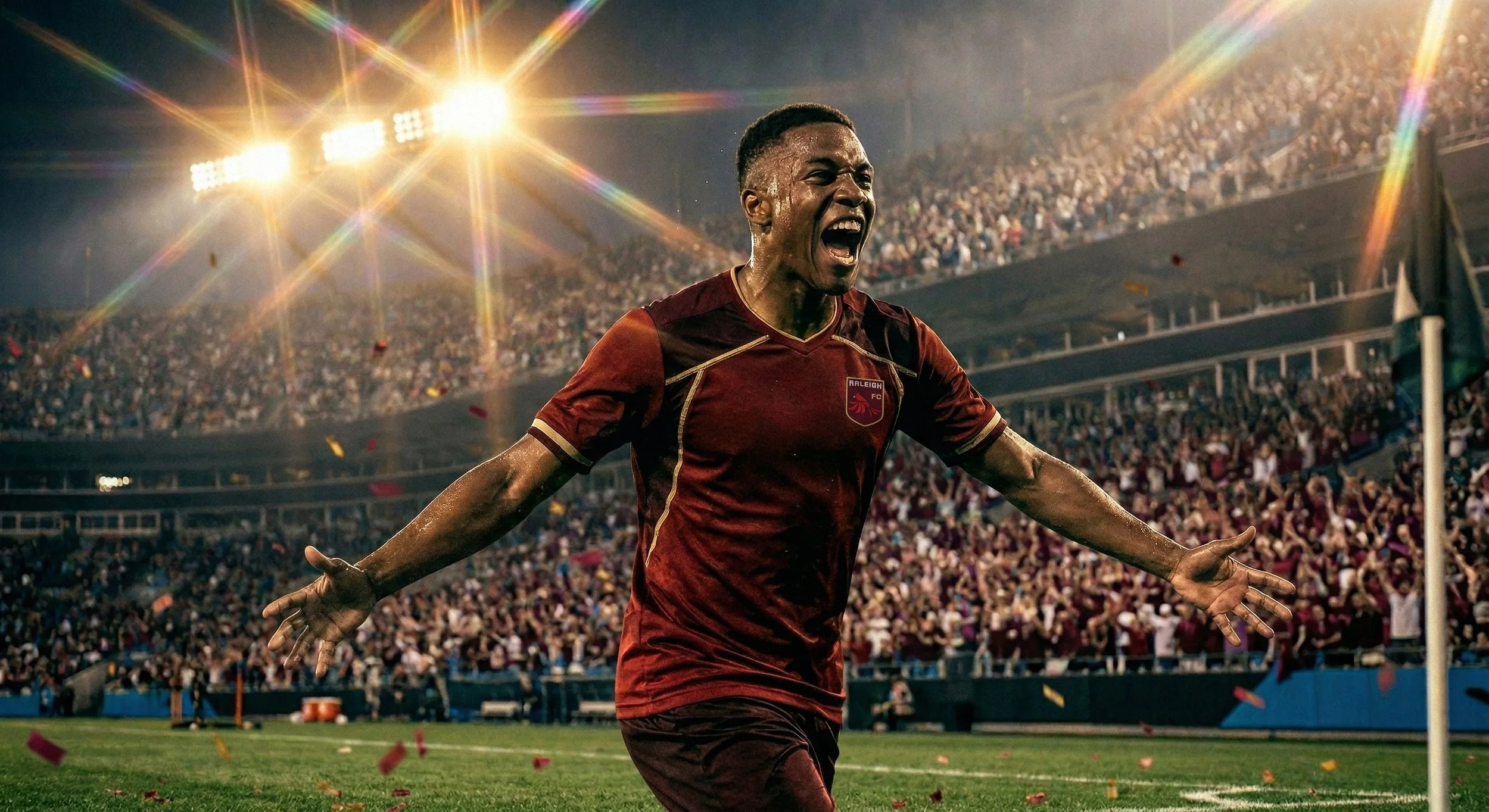
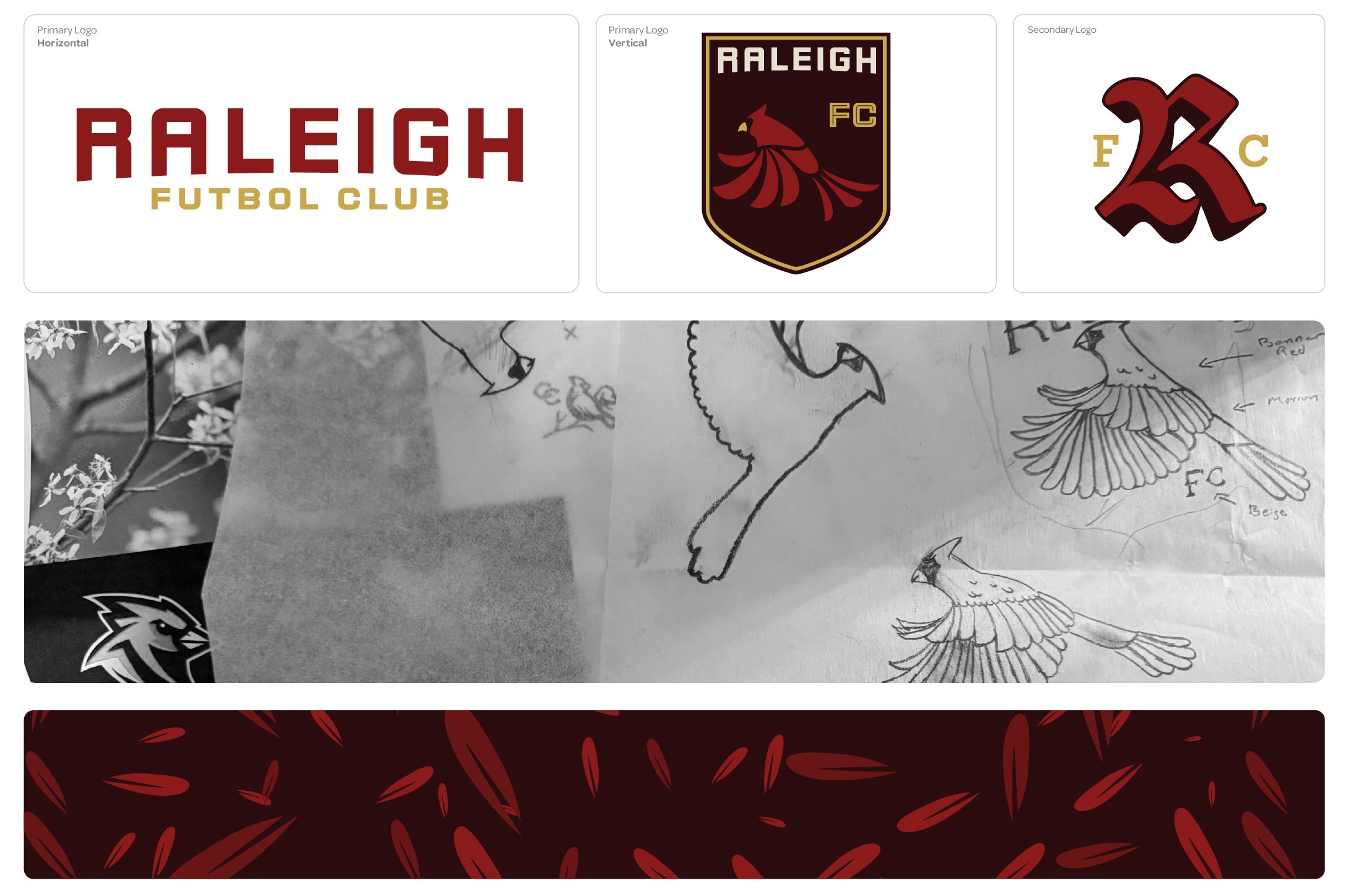
Raleigh FC is a concept identity created for a potential MLS expansion team, designed to capture the pride, energy, and heritage of North Carolina. At the core of the brand is the cardinal, the state bird, reimagined as a bold, modern crest that symbolizes resilience, unity, and homegrown strength. The color palette draws from deep reds and warm golds, reflecting both the intensity of match day and the rich character of Raleigh’s culture. I developed a complete visual system across kits, fan gear, and environmental applications, ensuring the mark holds strong from the pitch to the stands. This project showcases my approach to sports branding by blending regional storytelling with a clean, scalable identity that feels authentic to the city while ready for a national stage.